British Airways app experience
Spring 2020
At British Airways I lead a small design team working on customer experience improvements in the app.
You can see more of my work at British Airways on my blog.
You can see more of my work at British Airways on my blog.
iOS app


Previously the app often had copy sat on semi transparent panels with full bleed images behind. This layered approach worked really well on some images, but on others the information often wasn’t legible and the next best action unclear.
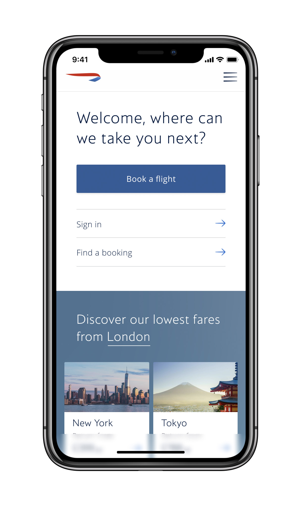
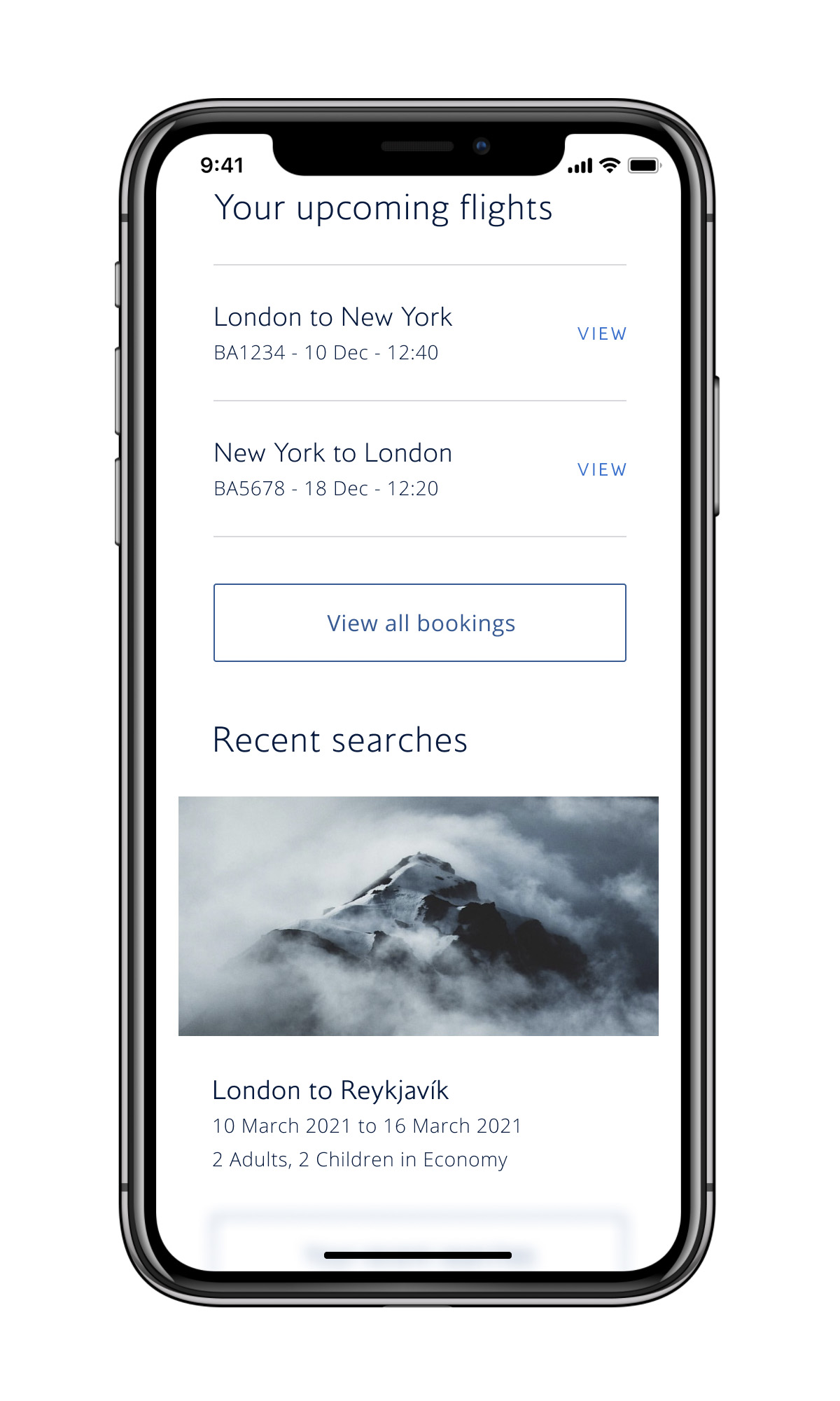
We introduced Mylius Extra Light across the experience and used white space and midight blue to create a clearer experience for every step of a customer’s journey, from signing in, to viewing flights, checking in and boarding. Working on a homescreen that is contextual meant that there are many scenarios shown to customers – as you can see here. In each, we used the headline to talk to customers in a contextual, conversational way. This approach supported text scaling throughout and also introduced AA colour contrast accessibility. Alongside using the updated design system we also refreshed destination imagery for the top searched and flown routes
Credits
Design: Adam McElligott, Veronica Nobili, Luca Rosean
Copy: Sam Antrobus
Engineering: Filippo Minelle
Product: Lucy Peyton, Sofia Calisto Miranda
Design direction: Tom Lancaster
Design system: DesignStudio with Nikki Barton, J-P Henry, Tom Lancaster
Copy: Sam Antrobus
Engineering: Filippo Minelle
Product: Lucy Peyton, Sofia Calisto Miranda
Design direction: Tom Lancaster
Design system: DesignStudio with Nikki Barton, J-P Henry, Tom Lancaster