Soulia Elements Therapies
Graphic Arts & Type client, 2021 and 2024
Soulia Elements Therapies provides client focussed massage and luxury aromatherapy products in London. Louisa Sisson, the founder, asked me to create a brand identity with her that works for both sides of the business. The identity is made up of four brand elements that can be combined together flexible across stationery, vouchers, packaging and online.
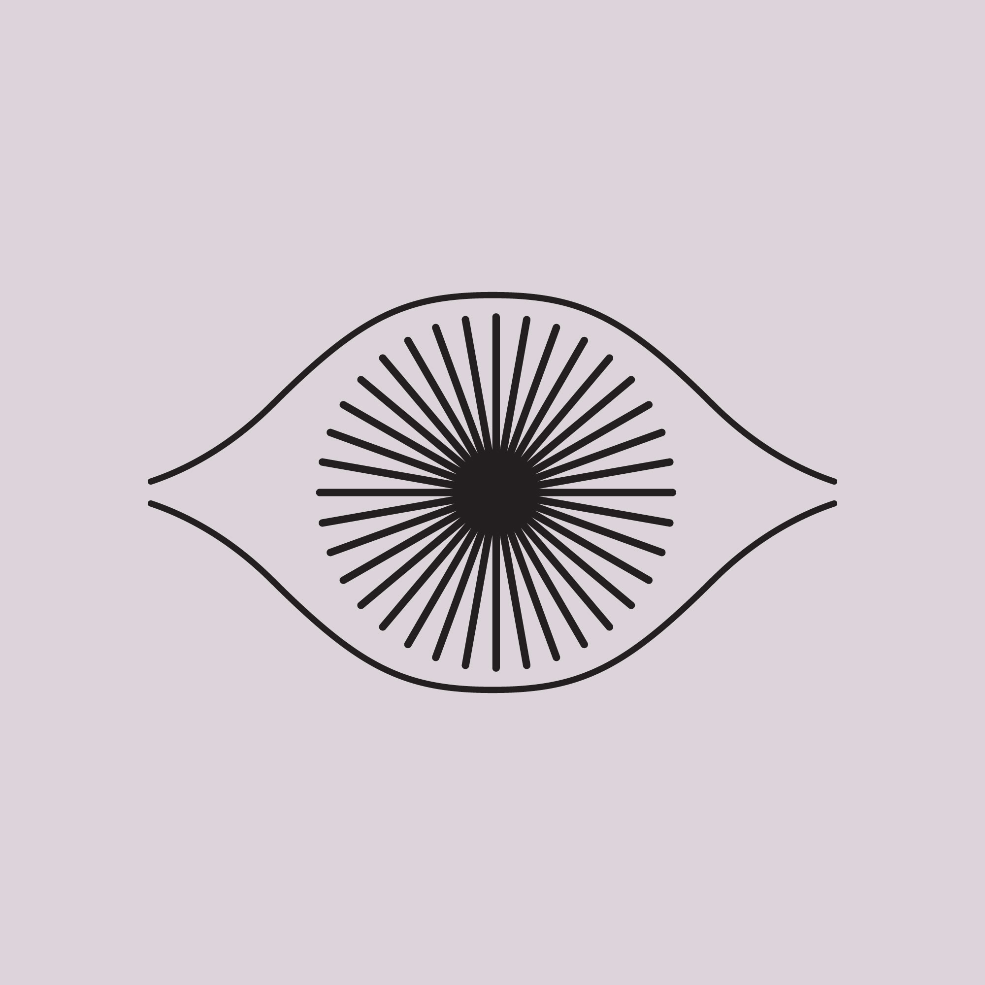
One: an eye
Inspired by the third eye, this minimal eye includes an optical sunburst graphic and is the soul element.
Inspired by the third eye, this minimal eye includes an optical sunburst graphic and is the soul element.
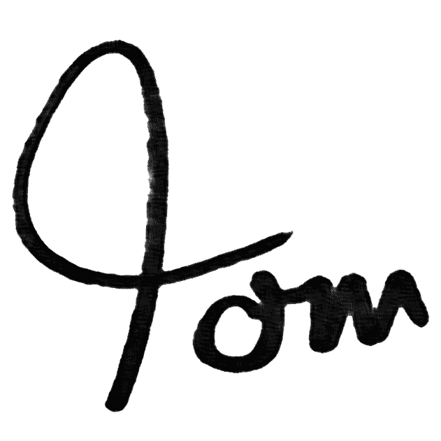
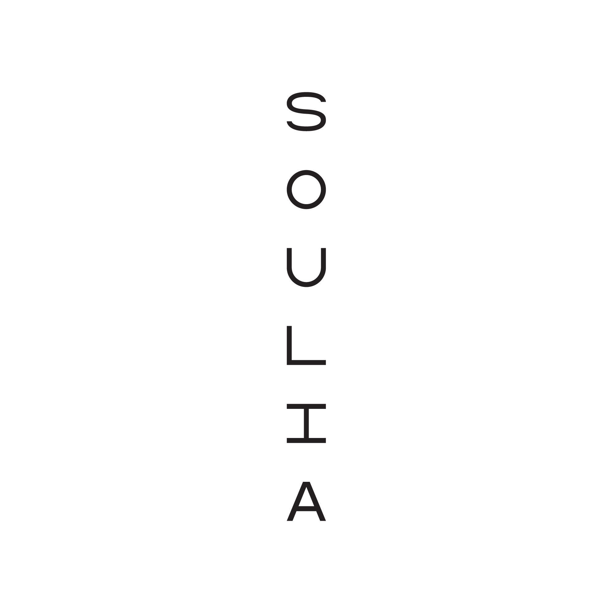
Two: A letterfall
The name is drawn in bespoke mono-width letters that cascade downwards - often from the eye. The words reflect the lightness of fleeting thoughts.
The name is drawn in bespoke mono-width letters that cascade downwards - often from the eye. The words reflect the lightness of fleeting thoughts.
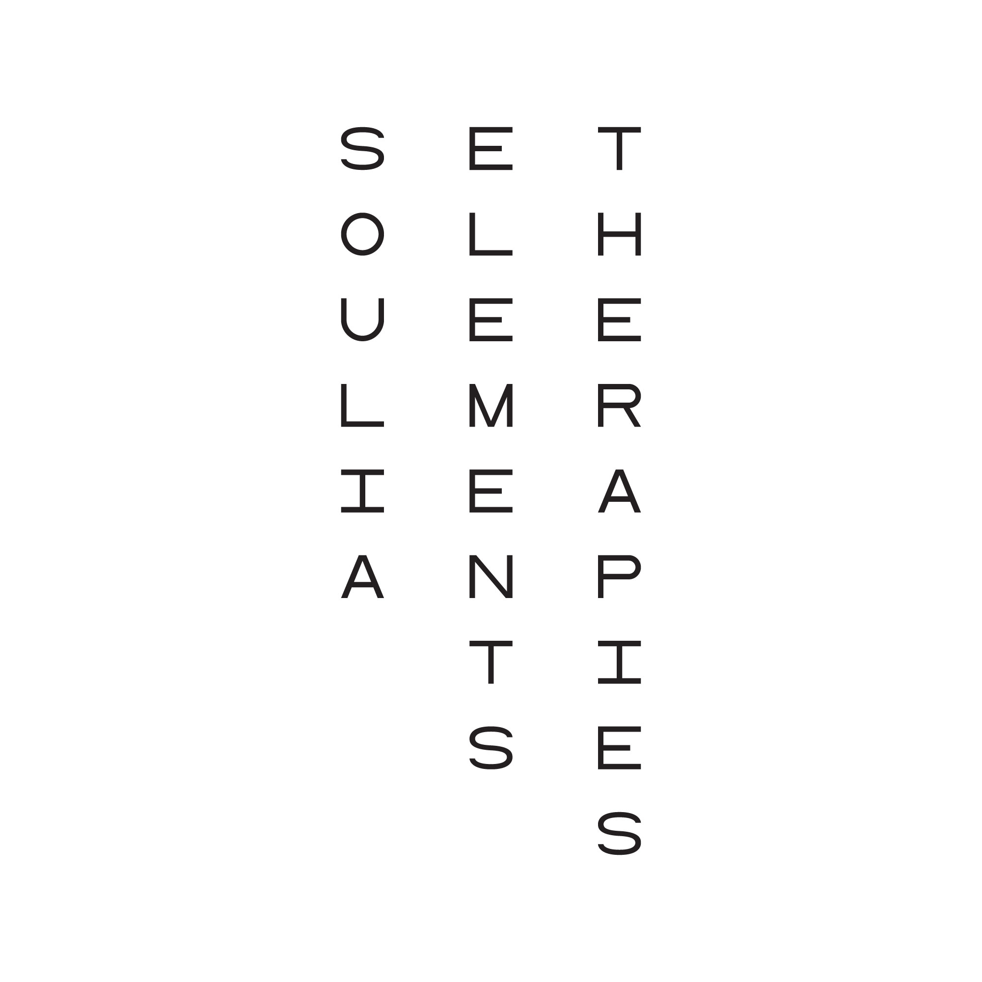
Three: a monogram
Giving weight and anchoring different graphic applications, the monogram brings together the three first letters and forms the bones of the brand - crossing over and offering structure. It comes into its own on smaller packaging spaces for the aromatherapy products and online.
Giving weight and anchoring different graphic applications, the monogram brings together the three first letters and forms the bones of the brand - crossing over and offering structure. It comes into its own on smaller packaging spaces for the aromatherapy products and online.

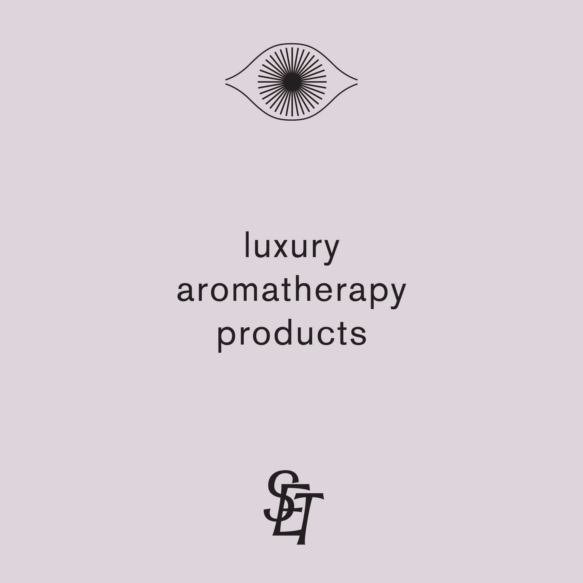
Four: a rose grey palette
Initially the brand was going to be always black and white, but we felt that this grey, warmed up with a little rose helped to soften the elements in certain settings - the tissue of the brand. Used under black and white photography and to define digital spaces.
Initially the brand was going to be always black and white, but we felt that this grey, warmed up with a little rose helped to soften the elements in certain settings - the tissue of the brand. Used under black and white photography and to define digital spaces.
Note
Soulia Elements Therapies is the new name for Four Elements Therapies and the work shown here is an update to the original brand identity I created in 2021.